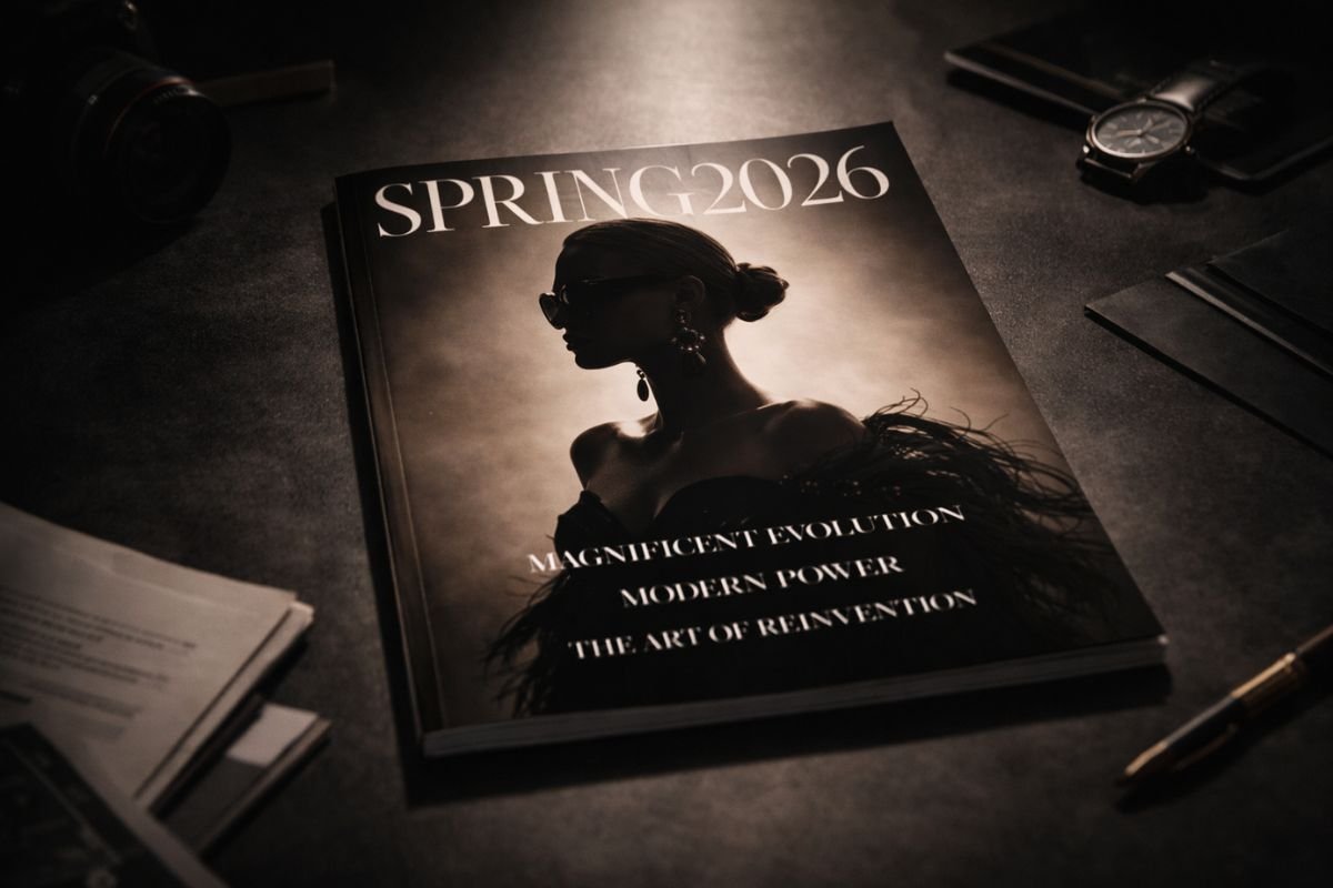

A brief overview
Color psychology in fashion design refers to how hues influence emotional response, social signaling, and visual perception, shaping how garments are interpreted before form or fabric is even considered. Designers use color as a primary communication tool, guiding mood, presence, and cultural meaning through visual tone.
Color as Emotional Language
In fashion, color operates as immediate information. Warm tones can suggest energy and visibility, while cooler shades often communicate calm or distance. This dynamic is central to color psychology in fashion design, where visual impact precedes narrative. A garment’s shade can shift how the wearer is perceived, influencing impressions of confidence, approachability, or restraint.
Because clothing exists in social space, these visual cues function as nonverbal dialogue. Color choices shape how bodies are read within environments, from public events to everyday settings.
Cultural Context and Perception
Color meaning is never isolated from culture. Shades carry associations built through history, tradition, and collective memory. Designers navigate these layers carefully, understanding that perception depends on shared references. What signals celebration in one context may express formality in another. The role of color psychology in fashion design, therefore, involves interpreting visual codes that audiences already recognize.
This awareness allows designers to create resonance rather than dissonance, aligning palette with message.
Silhouette, Light, and Visual Weight
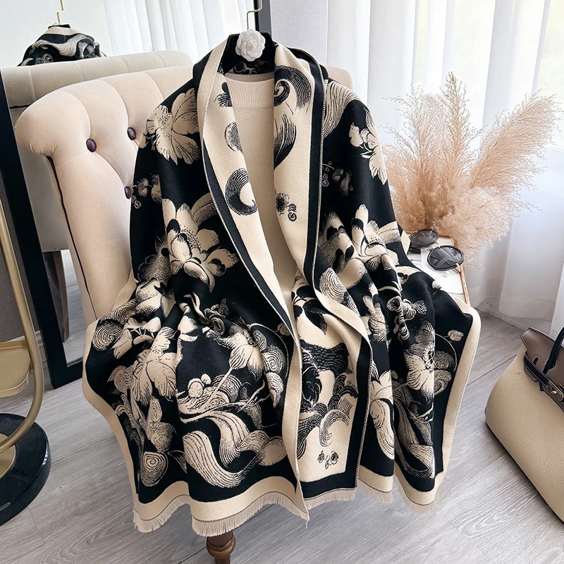
Beyond emotion, color alters perception of form. Darker tones can appear to absorb light, emphasizing outline and structure. Lighter or reflective shades highlight movement and surface. These optical effects shape how silhouettes are read, particularly in how silhouettes evolve across cultural contexts. Through color psychology in fashion design, hue becomes a tool for directing attention, framing proportion, and guiding the viewer’s eye.
Such decisions affect not only aesthetics but how garments function in photography, film, and digital media, where lighting conditions shift visual balance.
Modern Design Strategy
Contemporary designers often approach color with strategic precision. Seasonal palettes, tonal layering, and contrast placement build cohesion across collections. Rather than treating color as decoration, they use it to establish identity and narrative. The study of color psychology in fashion design supports this approach, linking visual choices to audience experience.
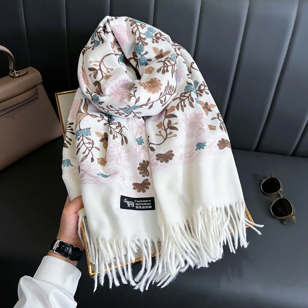
Minimalist schemes rely on subtle tonal shifts to maintain depth, while expressive palettes create immediate recognition. Both methods depend on understanding perception rather than intuition alone.
Visual Memory and Brand Identity
Color also anchors memory. Repeated use of certain tones helps audiences identify brands or creative signatures. Over time, these palettes gain cultural recognition, shaping how collections are remembered. The relationship between color and recall underscores why psychological understanding is central to design decisions.
Perception as Design Foundation
Ultimately, color psychology in fashion design highlights how visual perception drives fashion communication. Before texture is touched or construction examined, color establishes context. In much the same way, the psychology of hair demonstrates how external style choices can quietly shape inner emotional states and influence the way we carry ourselves.